A REDESIGN & STORYTELLING INITIATIVE I LED IN 2020:
SET SAIL WITH DIGITALOCEAN
KEY ISSUES & ROOT OF THE IDEA
The case study section of digitalocean.com was dry and transactional. There was no consistency in voice, no footprint throughout the site to connect mentioned products with associated product pages or the community sections of the site, which drove significant traffic. We were producing beautiful videos featuring customer stories, which had no home beyond YouTube, no dedicated social campaigns, and were quickly lost in the noise. Because we lacked a thoughtfully designed space for customer narratives, we were missing an opportunity to showcase meaningful and unique stories. This became particularly apparent after launching Hub for Good as a response to COVID-19 — a grant program for users who were using our tools to contribute to community initiatives.
OVERARCHING GOALS & VISION
My ideas were rooted in better connecting DigitalOcean’s product and community initiatives by thoughtfully redesigning the case study section of the site — and featuring human-centered, inspiring stories that captured genuine narratives of DigitalOcean users. Other goals included unifying the visitor experience by displaying stories in an easily navigable and searchable place; giving more permanence and visibility to the most inspiring user stories; creating more cohesive and connected pathways throughout the website; and elevating social responsibility initiatives like Hub for Good.

THE HOLISTIC SOLUTION OUTLINED
Reimagine and redesign the existing digitalocean.com/customers section of the site as a unified, central “house” for stories to include technical case studies, editorial stories, Hatch stories, and partner videos.
Update URL to digitalocean.com/stories (we can redirect /customers traffic here), so those we feature feel less like transactions and more like humans.
Establish categories that define story types: grow & scale, innovate, impact & inspire, Hatch(ed) (featuring graduates from the Hatch program).
Subnav will allow users to filter stories by product, initiative, program, keywords, etc. We will work with the UX/UI team on this.
Add compelling customer quote/testimonial to relevant product pages, linking back to associated story, along with a “Stories” section for individual products.
Add “Stories” section to /community where featured stories can be manually featured or aggregated by recency.
Create an editorial calendar based on company roadmap and key business goals, including product announcements/releases and community initiatives (Hub for Good, Hacktoberfest, Hatch, etc.).
Create compelling, less templated content with video, graphics, tech architecture diagrams, or custom assets to illustrate the nuances of a story.
We’ll create a simple iconography library for each product, which we’ll use in a graphic in each story, linking back to appropriate product pages.
Develop a social campaign for every story, and weave fresh stories into appropriate newsletters. Shareability potential is huge, especially when a story has a natural home and permalink.
CREATING THE PROJECT PLAN
I led a kickoff with the Brand team, conducted a site audit, connected with other teams, and created an initiative roadmap. After getting buy-in from leadership, we sifted through thousands of Hub for Good grant recipients to choose two to feature in the new visual and more interactive formats I envisioned. Working hand-in-hand with our video production manager and a front-end developer, I created low-fidelity wireframes demonstrating how these stories would function, provided creative direction for how this might look in a high-fidelity setting, wrote copy for the new landing page, and, lastly, crafted the first batch of stories. You can see my thought process, creative recommendations, and where we landed below.
THEN CAME THE STORIES
Once I created the roadmap, I wrote the first two stories, beginning with the introduction to the Hub for Good series followed by the story wireframes, functional annotations, and high-fidelity mockups.
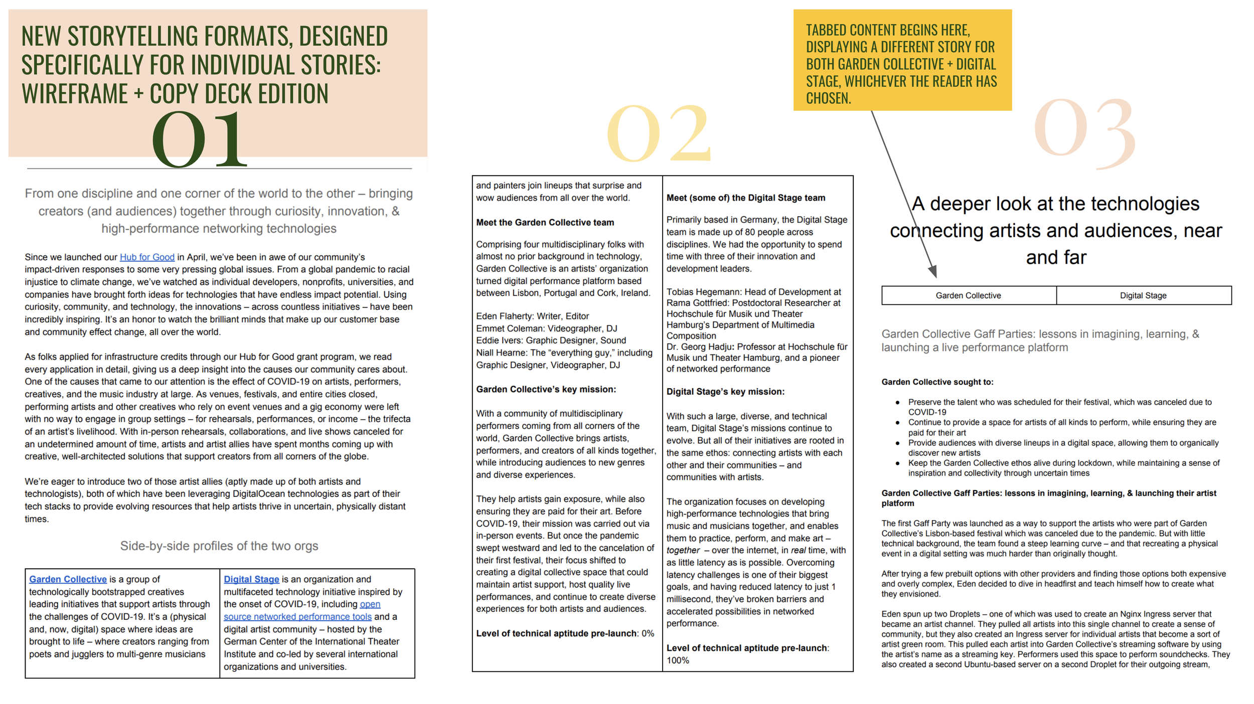
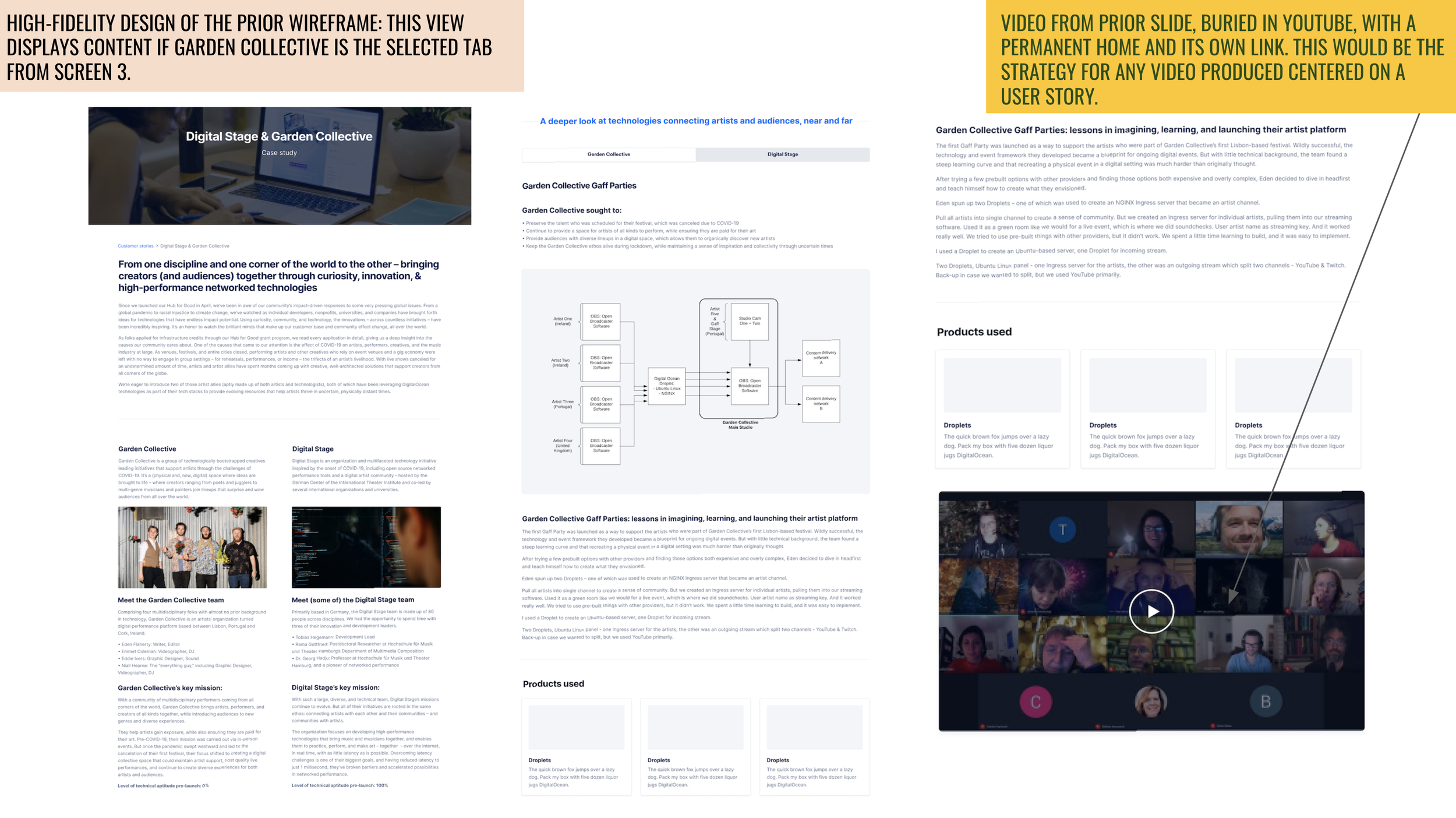
From one discipline and one corner of the world to the other – bringing creators (and audiences) together through curiosity, innovation, & high-performance networking technologies
Since we launched our Hub for Good in April (2020), we’ve been in awe of our community’s impact-driven responses to some very pressing global issues. From a global pandemic to racial injustice to climate change, we’ve watched as individual developers, nonprofits, universities, and companies have brought forth ideas for technologies that have endless impact potential. Using curiosity, community, and technology, the innovations – across countless initiatives – have been incredibly inspiring. It’s an honor to watch the brilliant minds that make up our customer base and community effect change, all over the world.
As folks applied for infrastructure credits through our Hub for Good grant program, we read every application in detail, giving us a deep insight into the causes our community cares about. One of the causes that came to our attention is the effect of COVID-19 on artists, performers, creatives, and the music industry at large. As venues, festivals, and entire cities closed, performing artists and other creatives who rely on event venues and a gig economy were left with no way to engage in group settings – for rehearsals, performances, or income – the trifecta of an artist’s livelihood. With in-person rehearsals, collaborations, and live shows canceled for an undetermined amount of time, artists and artist allies have spent months coming up with creative, well-architected solutions that support creators from all corners of the globe.
We’re eager to introduce two of those artist allies (aptly made up of both artists and technologists), both of which have been leveraging DigitalOcean technologies as part of their tech stacks to provide evolving resources that help artists thrive in uncertain, physically distant times.

Lastly, I worked with a UX designer to integrate the stories, functionality specs, and cross-linking guidance into high-fidelity layouts.
DESIGNING THE NEW STORIES SECTION OF THE SITE: (VERY) ROUGH SKETCHES TO HIGH-FIDELITY MOCKUPS
Note: I did the sketches based on the vision I had, while our UX designer created high-fidelity mockups based on those sketches. I wrote all initial landing page copy to reflect how I imagined stories would be organized, featured, and filtered on the page.
Not pictured: The search dropdown in the first section of the site gave users the ability to filter by business industry or story type — innovation, impact & inspire, grow & scale, Hatch(ed).


